来自于公众号:地学实践教程
install.packages("ggcor")
install.packages("devtools")
devtools::install_github("Github-Yilei/ggcor")
install.packages("tidyverse")


library(ggcor)
library(ggplot2)
setwd("E:/03Phd/20240612-zhizi/enviroment")
chem<-read.csv("E:/03Phd/20240612-zhizi/enviroment/zhi-dian.csv",header=T)#读取数据
figure<-quickcor(chem, cor.test = TRUE,p.value = FALSE) +
  geom_circle2(data = get_data(type = "lower", show.diag = FALSE),color="white") +
  geom_mark(data = get_data(type = "upper",
                            show.diag = FALSE),
            size = 1.7,
            mark = c("", "", "")) +
  geom_abline(slope = -1,
              intercept = 24, col="red")+
  scale_fill_gradient2(low = "blue",  # 负相关性的颜色
                       mid = "white", # 0相关性的颜色
                       high = "red",  # 正相关性的颜色
                       name="Correlation", # 颜色条的标题
                       limits = c(-1, 1)) # 相关性的范围
figure
像Science一样绘制相关性热图,看这一篇就够了
mp.weixin.qq.com王龙浩 地学实践教程
1 R语言绘制相关性热图全总结
2 引言
相关性热图是科研论文中一种常见的可视化手段,而在地学领域,我们常常需要分析一些环境因素之间的相关性,来判断环境生物因素中是否存在相关性情况。
尤其是在进行多变量分析时,分析目标因素和各变量之间的关系,往往需要首先考察变量之间的相关性,再考虑主成分等相关问题。地学环境生态领域常常用相关性热图的形式进行展示。总而言之,往大了说,任何表征相关性的数值都可以用相关性热图来进行绘制。
我们先来看看下面这张图,这是一篇发表在 ISME Journal ( IF = 11) 上的文章图,展示了生物和非生物因素的相关性。之间的相关性,其中红色的颜色代表负相关,蓝色代表正相关。每一格的数字代表相关系数。
Wijaya, W., Suhaimi, Z., Chua, C.X. et al. Frequent pulse disturbances shape resistance and resilience in tropical marine microbial communities. ISME COMMUN. 3, 55 (2023). https://doi.org/10.1038/s43705-023-00260-6
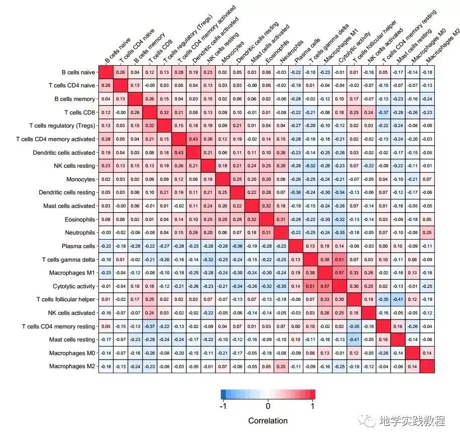
下图是一篇发表在 PLoS Medicine ( IF = 11.048) 上的文章图,展示了 22 种免疫细胞群体之间的相关性:
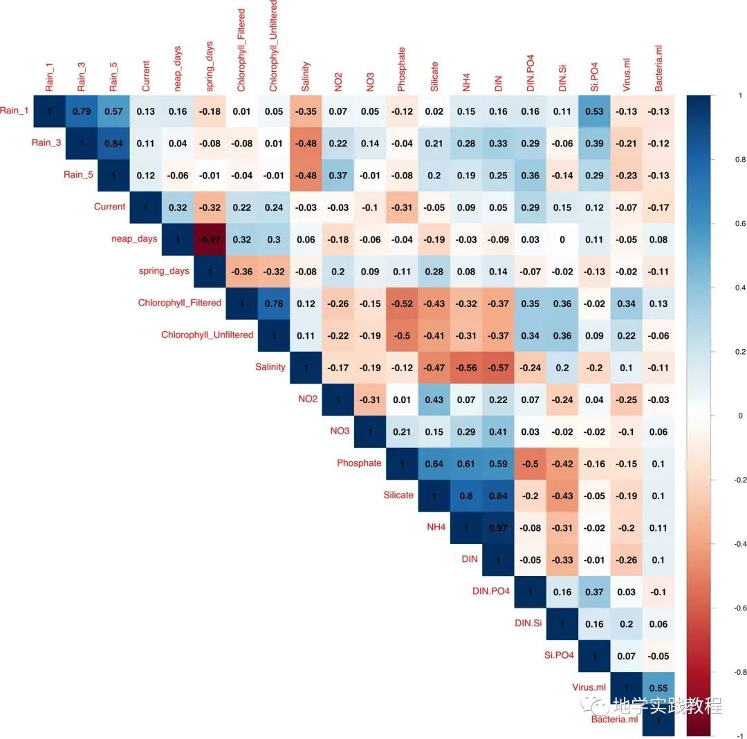
- 下图是发表在Scientific reports期刊上的一张相关性图,该图展示了微生物参数和土壤理化性质参数的Pearson相关性。
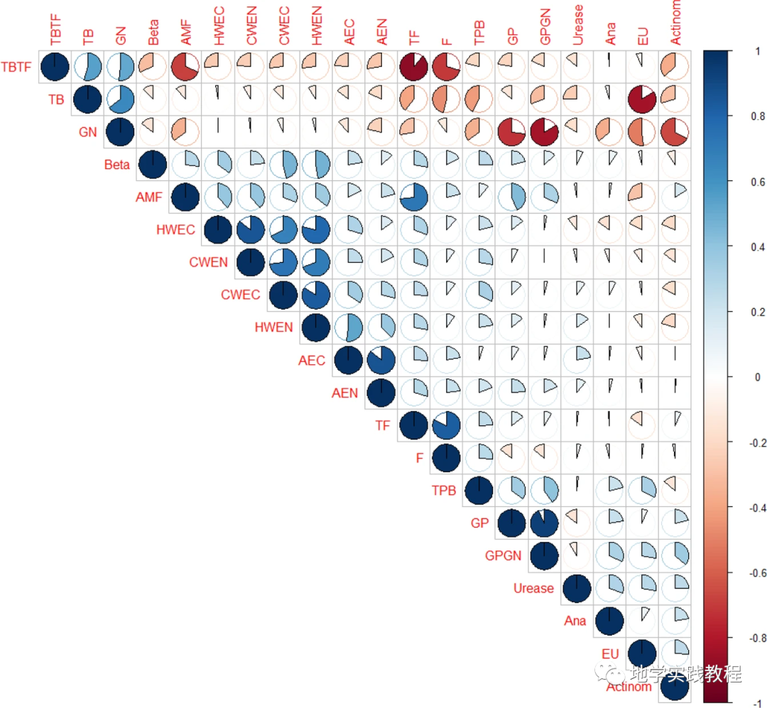
Ozlu, E., Sandhu, S.S., Kumar, S. et al. Soil health indicators impacted by long-term cattle manure and inorganic fertilizer application in a corn-soybean rotation of South Dakota. Sci Rep 9, 11776 (2019). https://doi.org/10.1038/s41598-019-48207-z
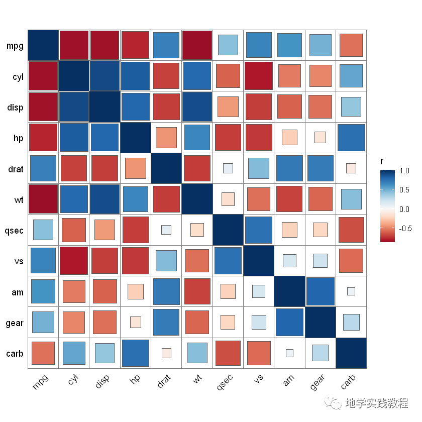
下图是发表在Science正刊上的一张相关性图,具有很高的颜值,同时是多个图表的组合。
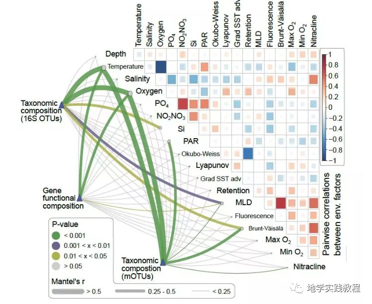
Sunagawa, S., Coelho, L. P., Chaffron, S., Kultima, J. R., Labadie, K., Salazar, G., … & Velayoudon, D. (2015). Structure and function of the global ocean microbiome. Science, 348(6237), 1261359.
其实这类相关性热图是使用R语言的ggcorrplot或corrplot包绘制的。能调整多种样式,你也能像顶刊一样绘制相关性结果。
3 ggcorrplot包
接下来介绍ggcorrplot包,进行一个简单的绘制,ggcorrplot包是2017年开发的,比较早,所以功能也比较简单。
首先安装ggcorrplot包
install.packages("ggcorrplot")- devtools::install_github("kassambara/ggcorrplot")-
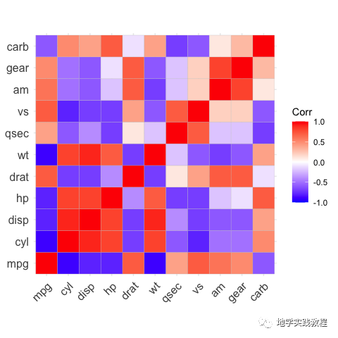
以mtcars内置数据为例:
`#Computeacorrelationmatrix- data(mtcars)- corr-round(cor(mtcars),1)- head(corr[,1:6])- #-%0Ahead(corr%5B,1:6%5D)-%0A#)mpgcyldisphpdratwt- #>mpg1.0-0.9-0.8-0.80.7-0.9- #>cyl-0.91.00.90.8-0.70.8- #>disp-0.80.91.00.8-0.70.9- #>hp-0.80.80.81.0-0.40.7- #>drat0.7-0.7-0.7-0.41.0-0.7- #>wt-0.90.80.90.7-0.71.0
Computeamatrixofcorrelationp-values- p.mat-cor_pmat(mtcars)- head(p.mat[,1:4])- #-%0A#)mpgcyldisphp- #>mpg0.000000e+006.112687e-109.380327e-101.787835e-07- #>cyl6.112687e-100.000000e+001.802838e-123.477861e-09- #>disp9.380327e-101.802838e-120.000000e+007.142679e-08- #>hp1.787835e-073.477861e-097.142679e-080.000000e+00- #>drat1.776240e-058.244636e-065.282022e-069.988772e-03- #>wt1.293959e-101.217567e-071.222320e-114.145827e-05
`
首先进行一个简单的绘制:
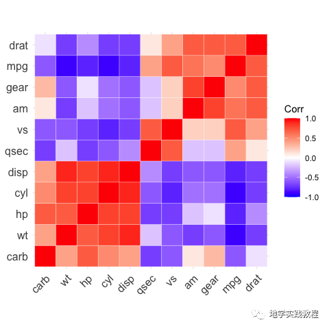
ggcorrplot(corr)-
将样式改为圆形:
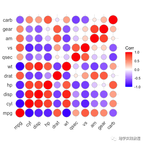
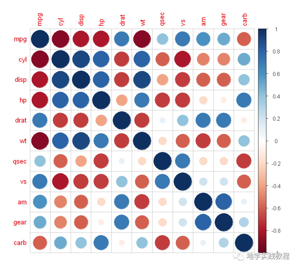
#method="circle"- ggcorrplot(corr,method="circle")-
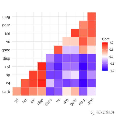
接下来使用hc.order关键字做层次聚类(hierarchical clustering)结果:
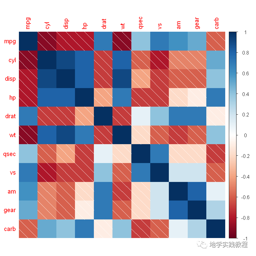
ggcorrplot(corr,hc.order=TRUE,outline.color="white")-
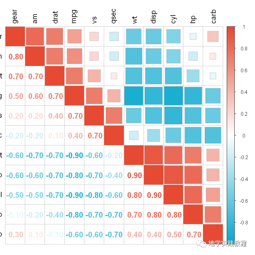
通过type=="lower"关键字来做下三角效果:
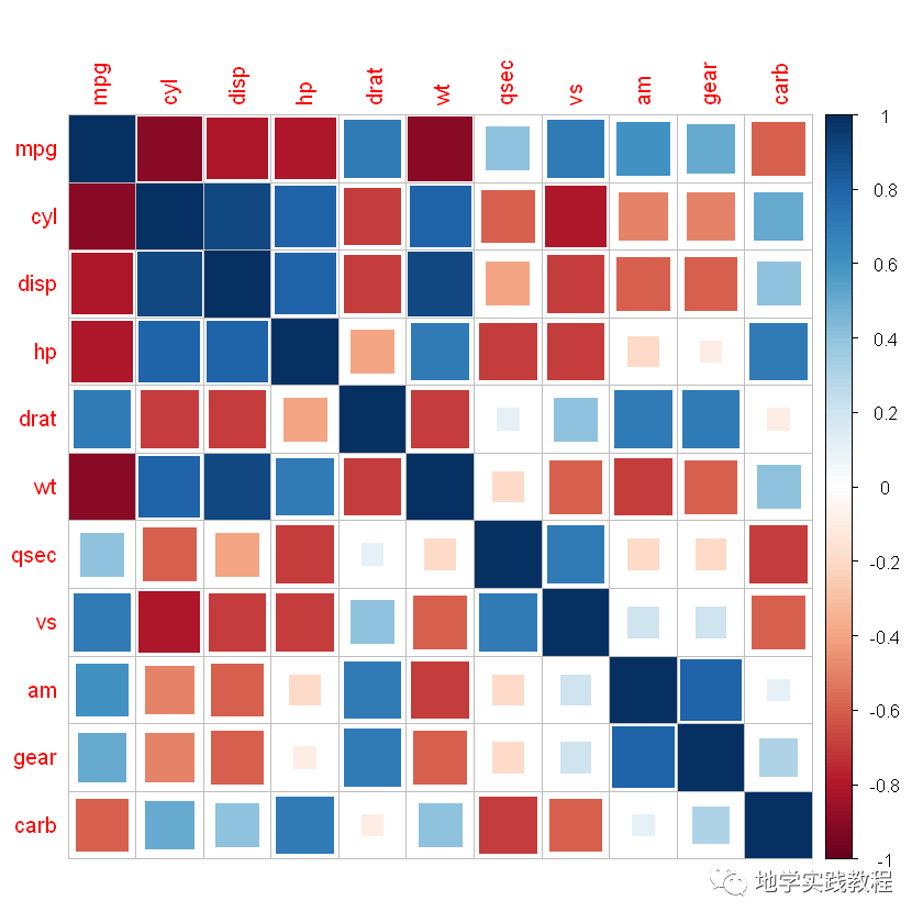
ggcorrplot(corr,- hc.order=TRUE,- type="lower",- outline.color="white")-
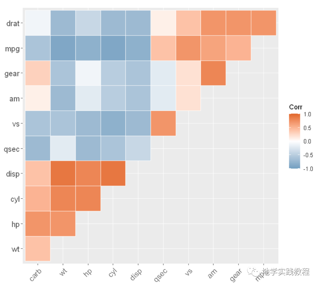
同理利用type = "upper"关键字做上三角效果:
ggcorrplot(- corr,- hc.order=TRUE,- type="upper",- outline.color="white",- ggtheme=ggplot2::theme_gray,- colors=c("#6D9EC1","white","#E46726")- )-
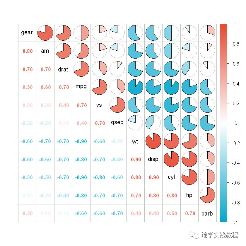
还可以标注显著性,通过lab = TRUE关键字:
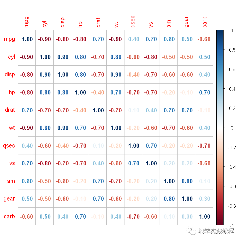
ggcorrplot(corr,- hc.order=TRUE,- type="lower",- lab=TRUE)-

通过关键字手动标识不显著的地方,画叉号:
ggcorrplot(corr,- hc.order=TRUE,- type="lower",- p.mat=p.mat)-

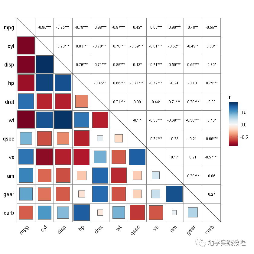
4 corrplot包
通过上述的结果,我们能实现顶刊1和2的效果,但是如果对于更复杂的图绘3,需要借助最新的corrplot包。该包是2021年发行的,比较新,能适用于更复杂和美观的效果。
首先安装corrplot包
install.packages("corrplot")-
以mtcars内置数据为例(上一节的数据示例):
data(mtcars)- corr<-round(cor(mtcars),1)-
首先查看默认的样式:
corrplot(corr)-
corrplot的默认样式就比ggcorrplot美观不少,但其实corrplot还提供了更多的样式:
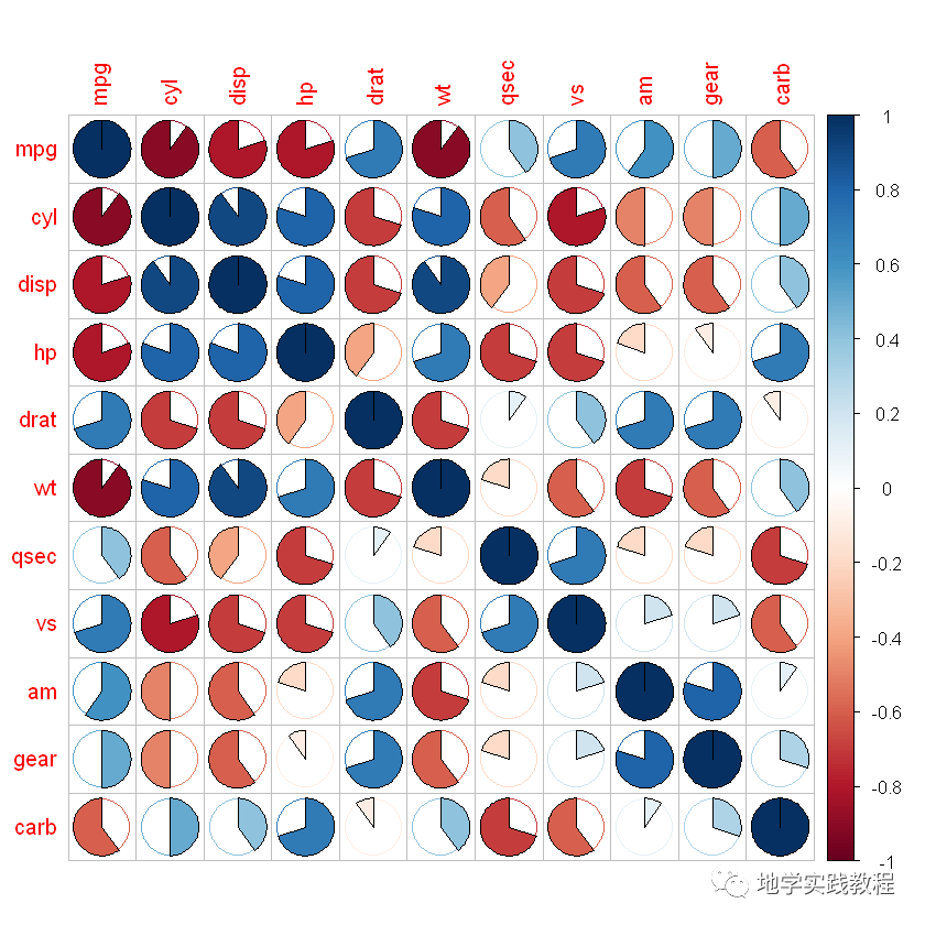
#可选图形样式:"circle","square","ellipse","number","shade","color","pie"- library(ggplot2)- corrplot(corr,method=c('square'))- corrplot(corr,method=c('ellipse'))- corrplot(corr,method=c('number'))- corrplot(corr,method=c('shade'))- corrplot(corr,method=c('color'))- corrplot(corr,method=c('pie'))-
- square
- ellipse
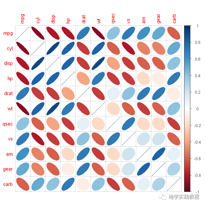
- number
- shade
- color

- pie
上述每种样式都很美观,可能有同学想要问了,如果我想要两种样式的组合怎么办?如上三角用圆形,下三角用显著性数字。这里按下不表,后文揭晓~
接下来介绍corrplot更多的参数:
outline = 'grey'是否为图形添加外轮廓线,默认FLASE,可直接TRUE或指定颜色向量col是自己定义的颜色或色卡order是聚类方式选择:”original”, “AOE”, “FPC”, “hclust”, “alphabet”tl.cex是文本标签大小tl.col文本标签颜色addgrid.col是文本标签颜色diag = FALSE是否展示对角线结果,默认TRUE
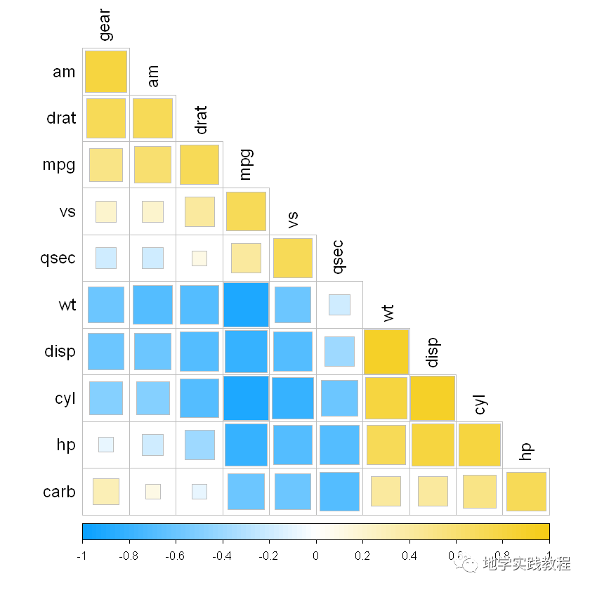
#参数介绍- mycol<-colorRampPalette(c("#06a7cd","white","#e74a32"),alpha=TRUE)- mycol2<-colorRampPalette(c("#0AA1FF","white","#F5CC16"),alpha=TRUE)- corrplot(corr,method=c('square'),type=c('lower'),- col=mycol2(100),- outline='grey',#是否为图形添加外轮廓线,默认FLASE,可直接TRUE或指定颜色向量- order=c('AOE'),#排序/聚类方式选择:"original","AOE","FPC","hclust","alphabet"- diag=FALSE,#是否展示对角线结果,默认TRUE- tl.cex=1.2,#文本标签大小- tl.col='black',#文本标签颜色- addgrid.col='grey'#格子轮廓颜色- )-
接下来叠加相关性结果:
addCoef.col = 'black'在现有样式中添加相关性系数数字,并指定颜色number.cex = 0.8是相关性系数数字标签大小
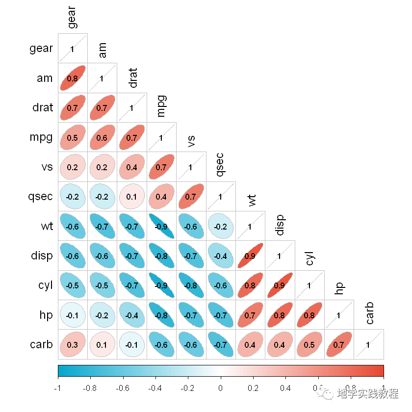
#叠加相关性- corrplot(corr,method=c('ellipse'),- type=c('lower'),- col=mycol(100),- outline='grey',- order=c('AOE'),- diag=TRUE,- tl.cex=1.2,- tl.col='black',- addCoef.col='black',#在现有样式中添加相关性系数数字,并指定颜色- number.cex=0.8,#相关性系数数字标签大小- )-
接下来实现不同主题的拼接效果,如半圆形半显著性文字。
这里我们使用add = TRUE关键字,可以在第一张图的基础上叠加第二张图(一般是上三角叠加下三角)
#半文字,半图- #需要先画上三角,再画下三角,用add关键字表示在第一张图基础上添加第二张- corrplot(corr,method=c('pie'),- type=c('upper'),- col=mycol(100),- outline='grey',- order=c('AOE'),- diag=TRUE,- tl.cex=1,#对角线文字大小- tl.col='black',#对角线文字颜色- tl.pos='d'#仅在对角线显示文本标签- )- corrplot(corr,add=TRUE,- method=c('number'),- type=c('lower'),- col=mycol(100),- order=c('AOE'),- diag=FALSE,- number.cex=0.9,- tl.pos='n',#不显示文本标签- cl.pos='n'#不显示颜色图例- )-
也可也选择其它样式:
#也可以选择在左方和上方添加文本标签:- corrplot(corr,method=c('square'),- type=c('upper'),- col=mycol(100),- outline='grey',- order=c('AOE'),- diag=TRUE,- tl.cex=1.2,- tl.col="black",- tl.pos="tp"- )- corrplot(corr,add=TRUE,- method=c('number'),- type=c('lower'),- col=mycol(100),- order=c('AOE'),- diag=FALSE,- number.cex=1.3,- tl.pos='n',- cl.pos='n'- )-
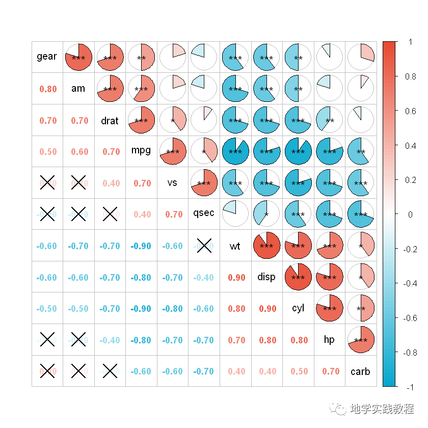
接下来使用p.mat = p关键字添加显著性星号和不显著叉号,在这之前我们要先计算p值:
`#显著性添加- #显著性计算:- res<-cor.mtest(mtcars,conf.level=.95)- p<-res$p
上三角图添加显著性水平星号:- corrplot(corr,method=c(‘pie’),- type=c(‘upper’),- col=mycol(100),- outline=’grey’,- order=c(‘AOE’),- diag=TRUE,- tl.cex=1,- tl.col=’black’,- tl.pos=’d’,- p.mat=p,- sig.level=c(.001,.01,.05),- insig=”labelsig”,#显著性标注样式:”pch”,”p-value”,”blank”,”n”,”labelsig”- pch.cex=1.2,#显著性标记大小- pch.col=’black’#显著性标记颜色- )- #下三角图添加不显著叉号:- corrplot(corr,add=TRUE,- method=c(‘number’),- type=c(‘lower’),- col=mycol(100),- order=c(‘AOE’),- diag=FALSE,- number.cex=0.9,- tl.pos=’n’,- cl.pos=’n’,- p.mat=p,- insig=”pch”- )
`
5 ggcor包
ggcor包是2021年最新开发的包,最新,实现了更多美观地绘制,当然corrplot已经足够使用了,这里做一个简单的介绍
ggcor和ggplot一样,是更方便的图层语言,在基础上叠加不同图层:
先安装ggcor包
devtools::install_github("Github-Yilei/ggcor")-
先进行一个简单的绘制:
library(ggplot2)- library(ggcor)- set_scale()- quickcor(mtcars)+geom_square()-
由于这是图层语言,可以直接叠加geom_circle2函数:
quickcor(mtcars,type="upper")+geom_circle2()-
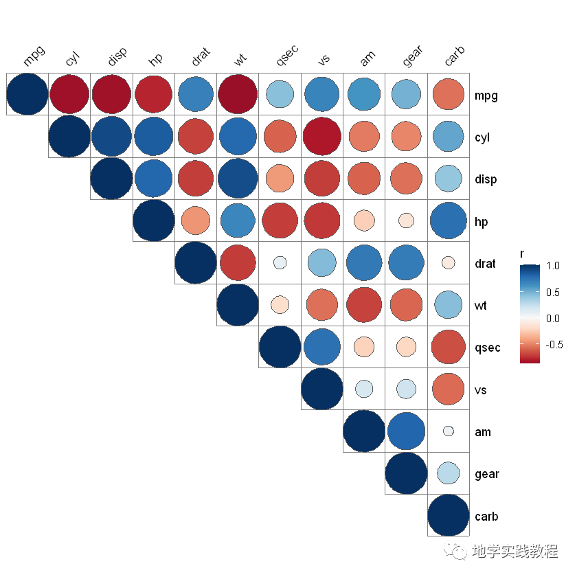
- 通过叠加不同的图层:
quickcor(mtcars,cor.test=TRUE)+- geom_square(data=get_data(type="lower",show.diag=FALSE))+- geom_mark(data=get_data(type="upper",show.diag=FALSE),size=2.5)+- geom_abline(slope=-1,intercept=12)-
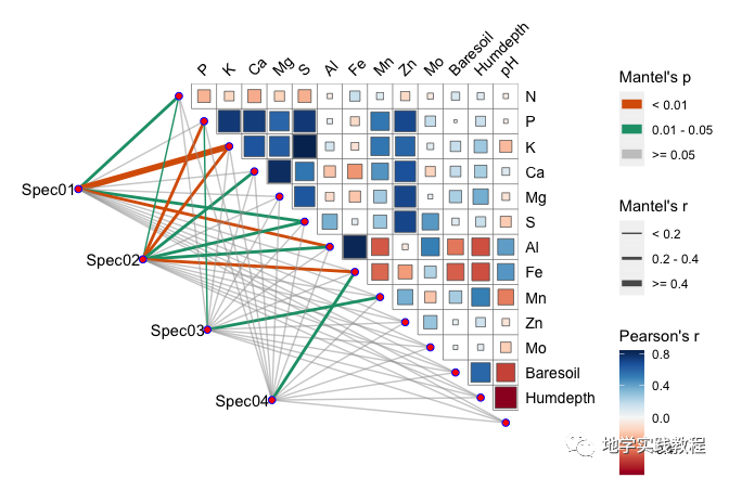
接下来通过ggcor实现Mantel test可视化分析
Mantel test是一个分析两个矩阵相关关系的方法,这种分析方法可用在植物微生物群落与生态环境之间相关性的检验等等
下面的代码直接复现上文Science正刊的内容:
`library(dplyr)- #>Warning:package’dplyr’wasbuiltunderRversion3.6.2- data(“varechem”,package=”vegan”)- data(“varespec”,package=”vegan”)
mantel-mantel_test(varespec,varechem,- spec.select=list(Spec01=1:7,- Spec02=8:18,- Spec03=19:37,- Spec04=38:44))%%25)%- mutate(rd=cut(r,breaks=c(-Inf,0.2,0.4,Inf),- labels=c(“<0.2″,”0.2-0.4″,”>=0.4″)),- pd=cut(p.value,breaks=c(-Inf,0.01,0.05,Inf),- labels=c(“<0.01″,”0.01-0.05″,”>=0.05″)))
quickcor(varechem,type=”upper”)+- geomsquare()+- annolink(aes(colour=pd,size=rd),data=mantel)+- scalesizemanual(values=c(0.5,1,2))+- scalecolourmanual(values=c(“#D95F02″,”#1B9E77″,”#A2A2A288”))+- guides(size=guidelegend(title=”Mantel’sr”,- override.aes=list(colour=”grey35″),- order=2),- colour=guidelegend(title=”Mantel’sp”,- override.aes=list(size=3),- order=1),- fill=guide_colorbar(title=”Pearson’sr”,order=3))
`
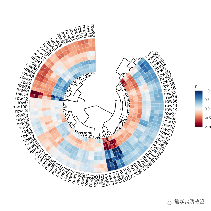
ggcor包还可以绘制环状热图Circular heatmap
rand_correlate(100,8)%>%##requireambientpackages- quickcor(circular=TRUE,cluster=TRUE,open=45)+- geom_colour(colour="white",size=0.125)+- anno_row_tree()+- anno_col_tree()+- set_p_xaxis()+- set_p_yaxis()- #>Warning:Removed8rowscontainingmissingvalues(geom_text).-