# 加载所需的库
library(ggplot2)
library(readxl)
library(reshape2)
# 读取Excel文件
data <- read_excel("gc.xlsx")
# 将数据从宽格式转换为长格式
data_long <- melt(data, id.vars = "variable", variable.name = "factor", value.name = "value")
# 定义颜色
colors <- c(rgb(2, 3, 3, maxColorValue = 255),
rgb(202, 74, 46, maxColorValue = 255),
rgb(232, 141, 47, maxColorValue = 255),
rgb(200, 200, 100, maxColorValue = 255),
rgb(59, 165, 149, maxColorValue = 255),
rgb(32, 117, 106, maxColorValue = 255))
# 绘制多因子分组柱状图并添加数值标签(保留3位小数)
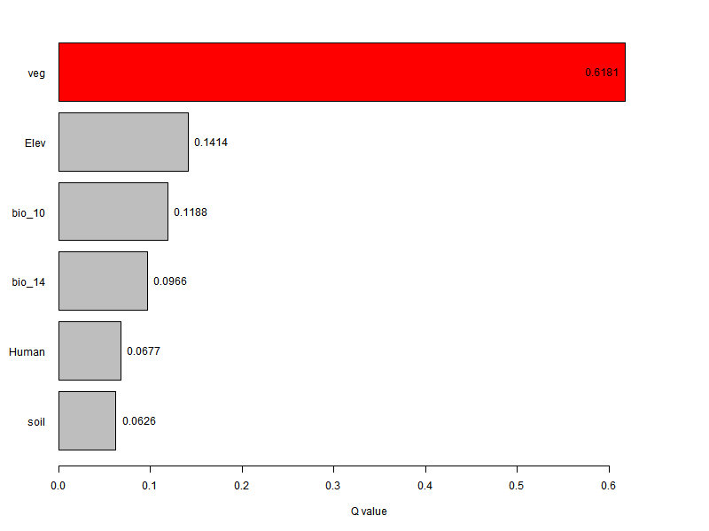
a <- ggplot(data_long, aes(x = variable, y = value, fill = factor)) +
geom_bar(stat = "identity", position = position_dodge(width = 0.7), width = 0.7) +
geom_text(aes(label = sprintf("%.3f", value)), position = position_dodge(width = 0.7), vjust = -0.5, size = 3) +
scale_fill_manual(values = colors) +
labs(x ="" ,y = "q value", fill = "") + # 将图例标题设置为空字符串
theme_minimal() +
theme(
plot.title = element_text(hjust = 0.5, face = "bold", size = 16),
axis.text = element_text(face = "bold", size = 12),
axis.title = element_text(face = "bold", size = 14),
legend.title = element_blank(), # 隐藏图例标题
legend.text = element_text(size = 10),
legend.position = c(0.1, 0.8), # 将图例放在图片内部,位置为 (0.8, 0.2)
legend.direction = "vertical", # 图例方向为chuizhi
panel.grid.major.y = element_line(color = "gray80", size = 0.5),
panel.grid.minor.y = element_line(color = "gray90", size = 0.25),
panel.background = element_rect(fill = "white")
)
a
# 保存图形到文件
ggsave("qvalue.eps", plot = a, width = 8, height = 6, device = "eps")
ggsave("multi_factor_grouped_bar_chart.png", plot = a, width = 10, height = 6, dpi = 300)